Do they really fraternise
In an ever-increasing fashion, the need for synergy in everyday attractions has led to a mixture of results; one of the more popular avenues is the attempted symbiosis of food and art. Compared to other ideas, such as fusion food, this involves a seamless mix of two wholly different areas. As a result, not everyone gets it right: it becomes common that one aspect is neglected for the other. Throughout London, various restaurants and establishments have attempted to make their mark in this unusual category – few have succeeded. Below shows three establishments which seem to combine the two fields in a way no one has yet done.
Bao
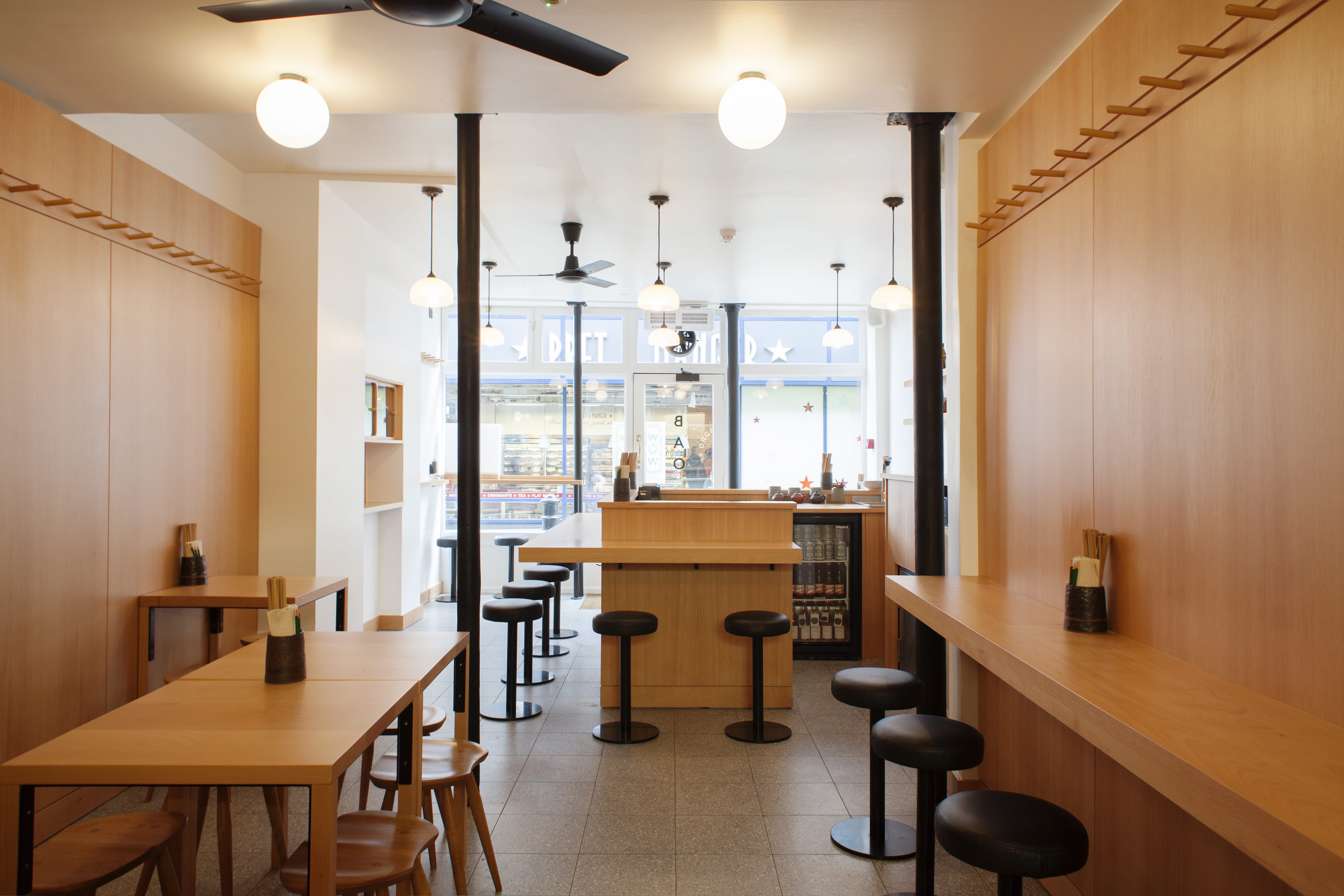
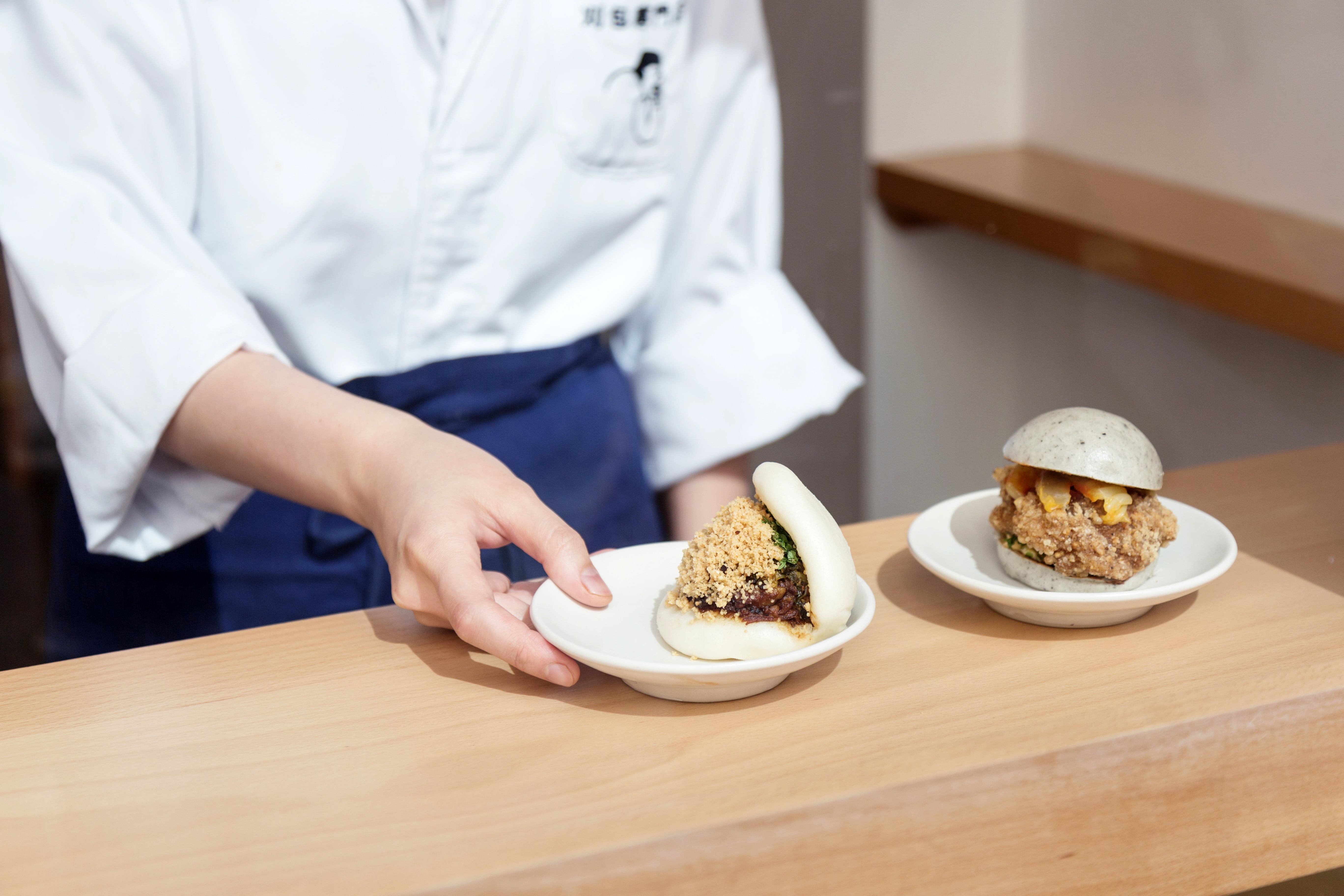
With regards to this article, the word ‘art’ encapsulates a whole range of ideas, not restricting to physical drawings or sculptures. What ‘BAO’ manages to do is offer a contrast between its food and art. Its food richly originates from Taiwanese origins, and it shows: the eponymous white buns, ‘gua bao’, are hand-made, filled with authentic ingredients shipped from Taiwan itself; no shortcuts are taken in flavour. Most of all, the food is relatively cheap: with the most expensive item being six pounds, it allows customers to gorge on whatever takes their fancy. Unique items, such as peanut milk, pig blood cake, and mushroom with century egg, to name a few, offer new experiences, none of which disappoint.
Where ‘BAO’ succeeds in its ‘art’ aspect revolves around its architecture. Its furnishings are all the same style: clean lines, solid colours – plain and simple. Whilst its food is opulent and ornate, its interior is modern and minimalistic; the juxtaposition exists to bring more attention to the food. Described before as one of the two facets being neglected for the other, in this case, one has been deliberately chosen to be subtly neglected. It seems that way, since it appears not much care goes into the design. However, the ‘BAO’ team decided to ‘let the food do the talking’.
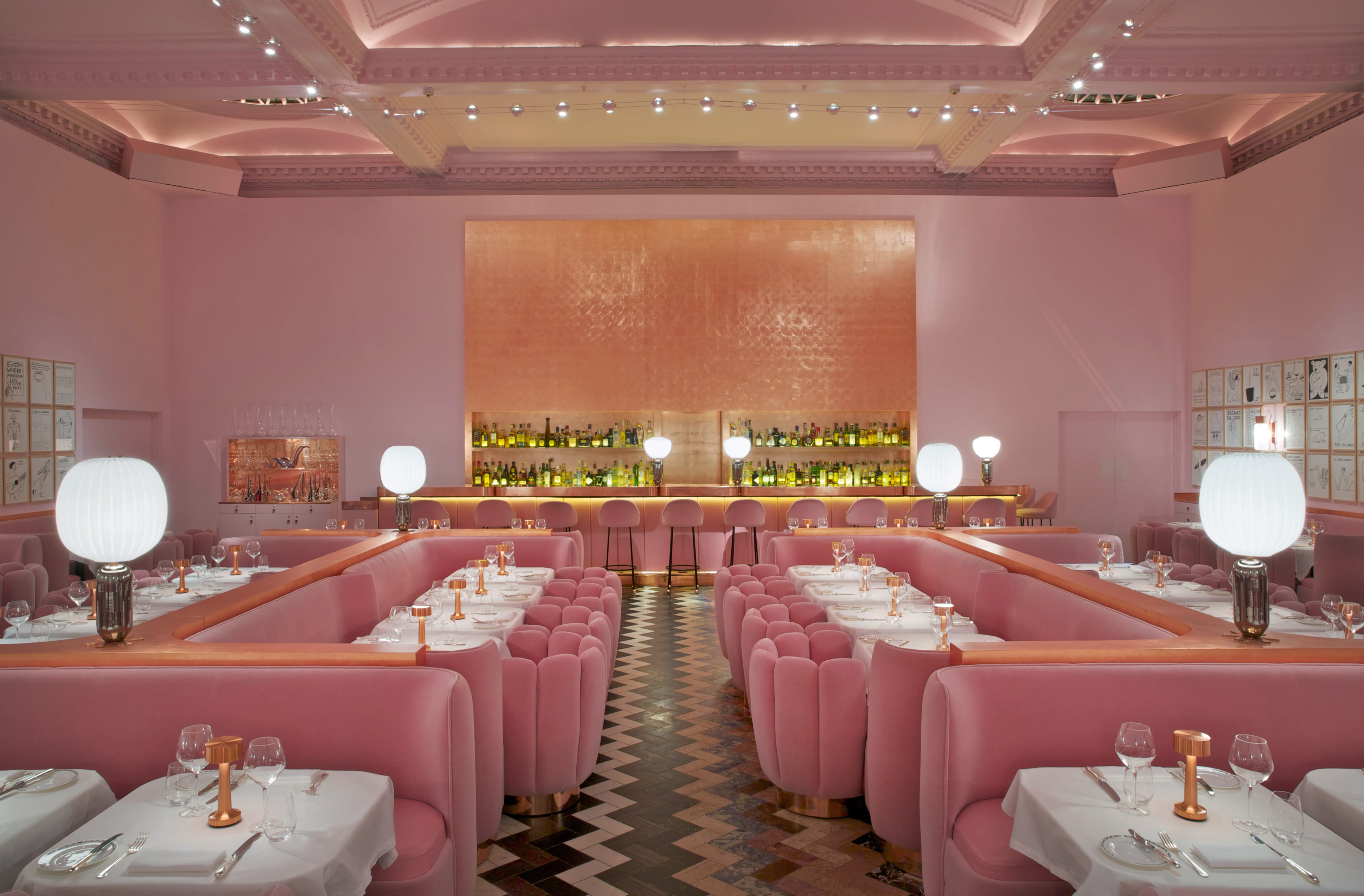
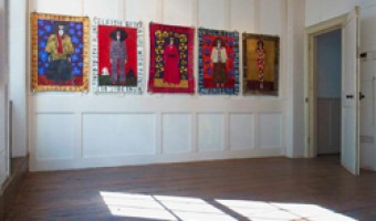
Its team of designers have taken inspiration from various sources – the list is suggested to be endless. In particular, one expects some literary influences. Its idea of a world within itself feels genuine, yet has that Carrollian feel where everything is not the same. It even comes with a short story as an introduction. To emphasise this, the design installations of the Gallery are ephemeral – not long ago, it was the work of Martin Creed that adorned those now pink walls. Eventually, the ornate artwork of David Shrigley will make way for something new; a habit of referencing the past, whilst looking to the future, is a strange concept, but still well executed by ‘sketch’. Its ever-changing nature, but uncompromising aim is what makes ‘sketch’ so unique. Step into its wonderland for an immersive experience – in truth, no two visits could ever be the same.


Duck and Waffle
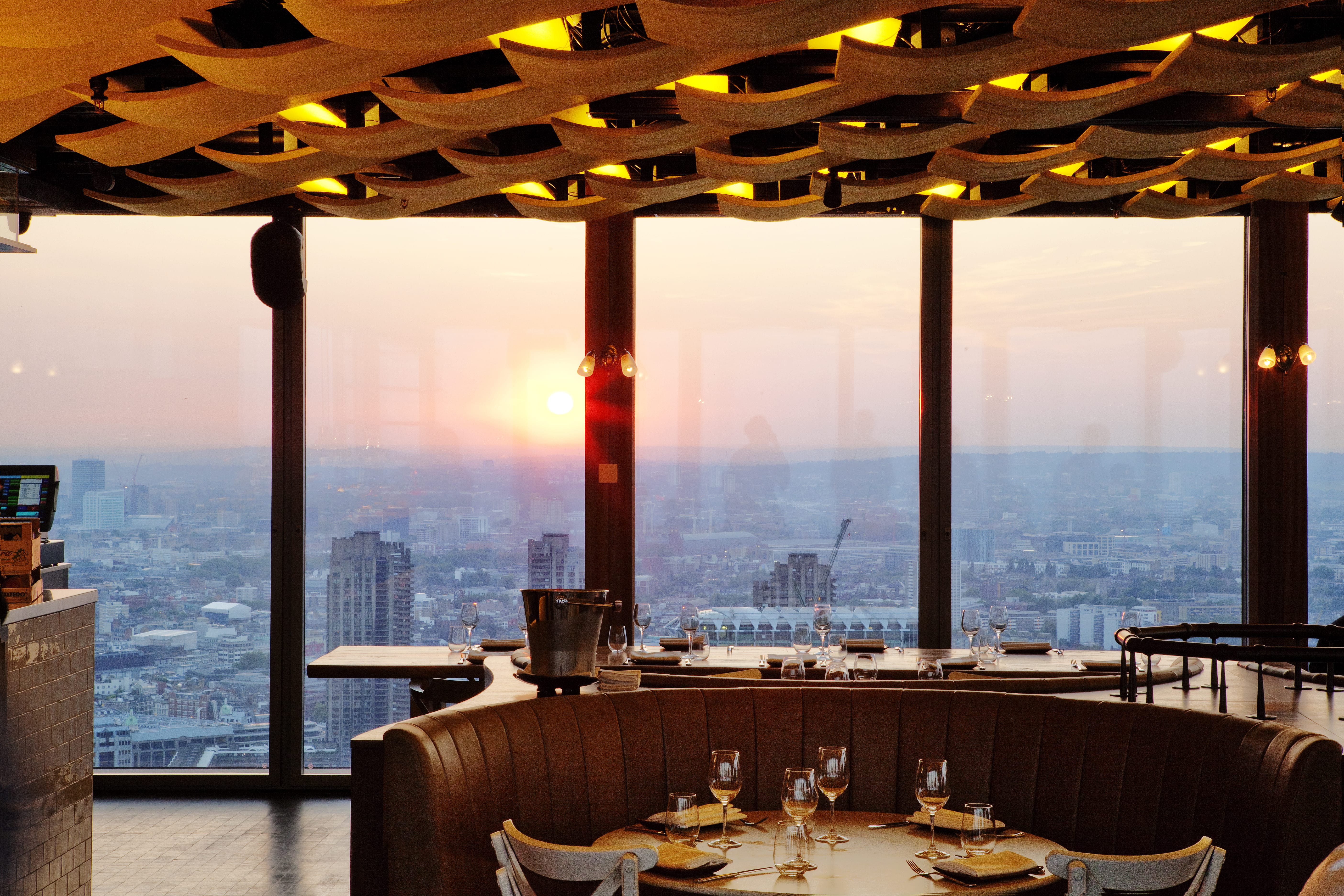
Often when an establishment attempts to offer a synergy of these two clashing ideas, many believe the optimum ratio would be to highlight both of its high qualities. The problem with this is that often, one such high-quality becomes a USP; therefore, how can this be compromised for another USP-worthy characteristic? What this restaurant does is bypass this question, by its own different juxtaposition. The food, simple yet refined, is paired up with breath-taking views from the 40th floor of the Heron Tower. Its choice of having ‘floor-to-ceiling’ windows provides customers with an incomparable view of the iconic London skyline, which has definitely become its USP in its own right. Whilst ‘BAO’ draws emphasis on its food, ‘Duck and Waffle’ draws emphasis on its art.
Its food, understandably, is wonderful – and yet, nothing to laud over. It has deliberately offered to keep the food, while sometimes exotic, relatively straight-forward. However, it does offer ‘iconoclastic cocktails’; this is where the food blends into art. Its decision to experiment with cocktails offers a futuristic tone to the whole experience. Customers nestled in this forward-thinking building can only help but to look down on the rest of the buildings; around the area, the architecture shows very strong themes of brutalism. It is a symbolic gesture, rather suggesting that the customers look at what London has to offer, as it enters an exciting age.


sketch
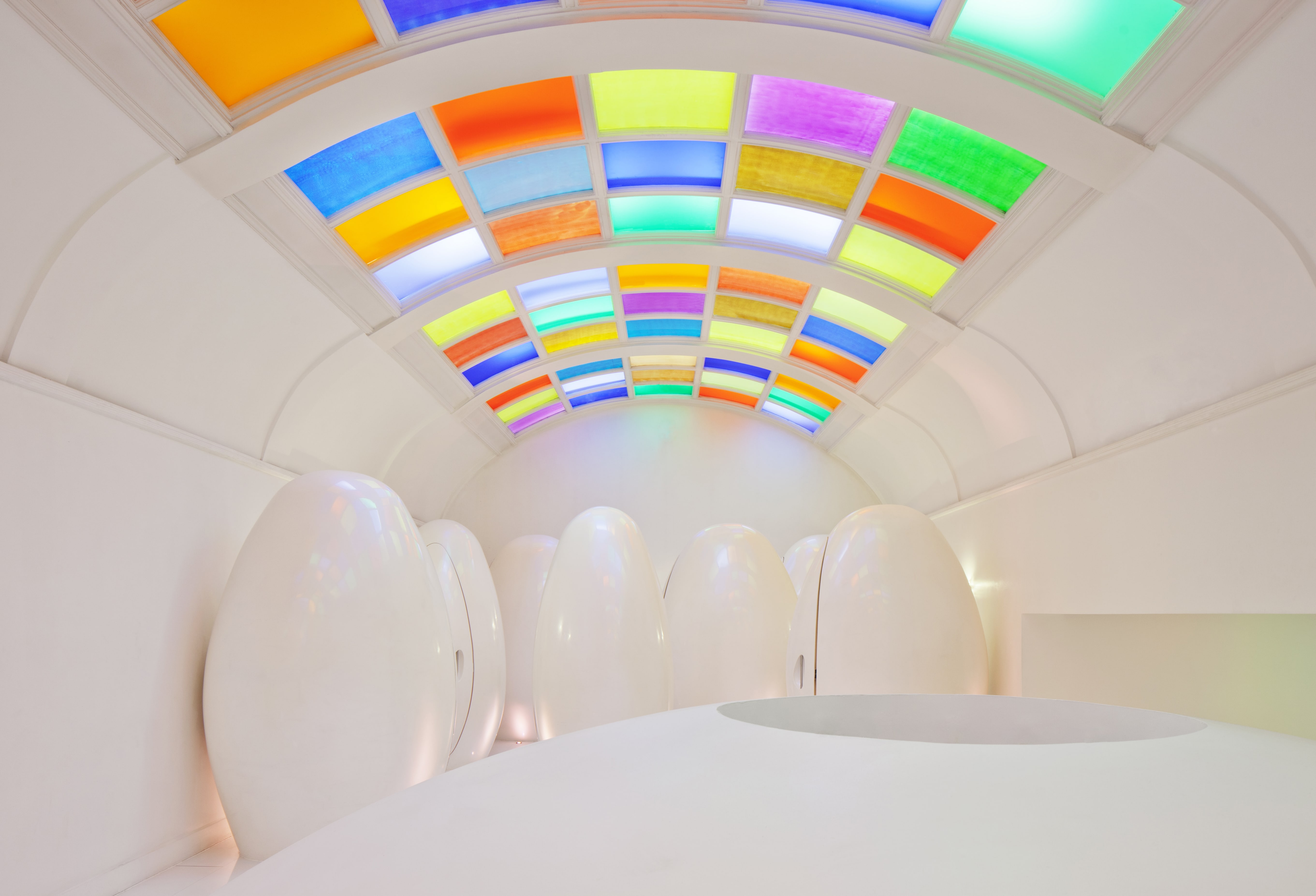
Of the entries mentioned here, this is unanimously regarded as being the pinnacle of its symbiosis. Its name is ‘sketch’. There is no capitalisation; it is adamant about that. Its artistic integrity has been highly conceptualised from the beginning by Mourad Mazouz, a restauranteur with many celebrated ones in Paris. Its entire design is antithetical to its themes: while its overall themes seamlessly merge with one another, its layout shows detailed compartmentalisation. The place has five areas: the Lecture Room & Library, the Parlour, the Glade, the East Bar, and the Gallery – each of them with a different aesthetic than the next. To top this, its washrooms are highly lauded for their inventiveness, with its design often entering a list for ‘the top 10 best toilets in the UK’, as well as being the highlight of many Instagram photos. With the food being created by Pierre Gangaire, it is thought that their partnership was designed to complement each other – and it has shown, recently crowned the winner of the ‘TimeOut Love London’ award in 2015.


 The fusion of art and food


 Load more triptoids